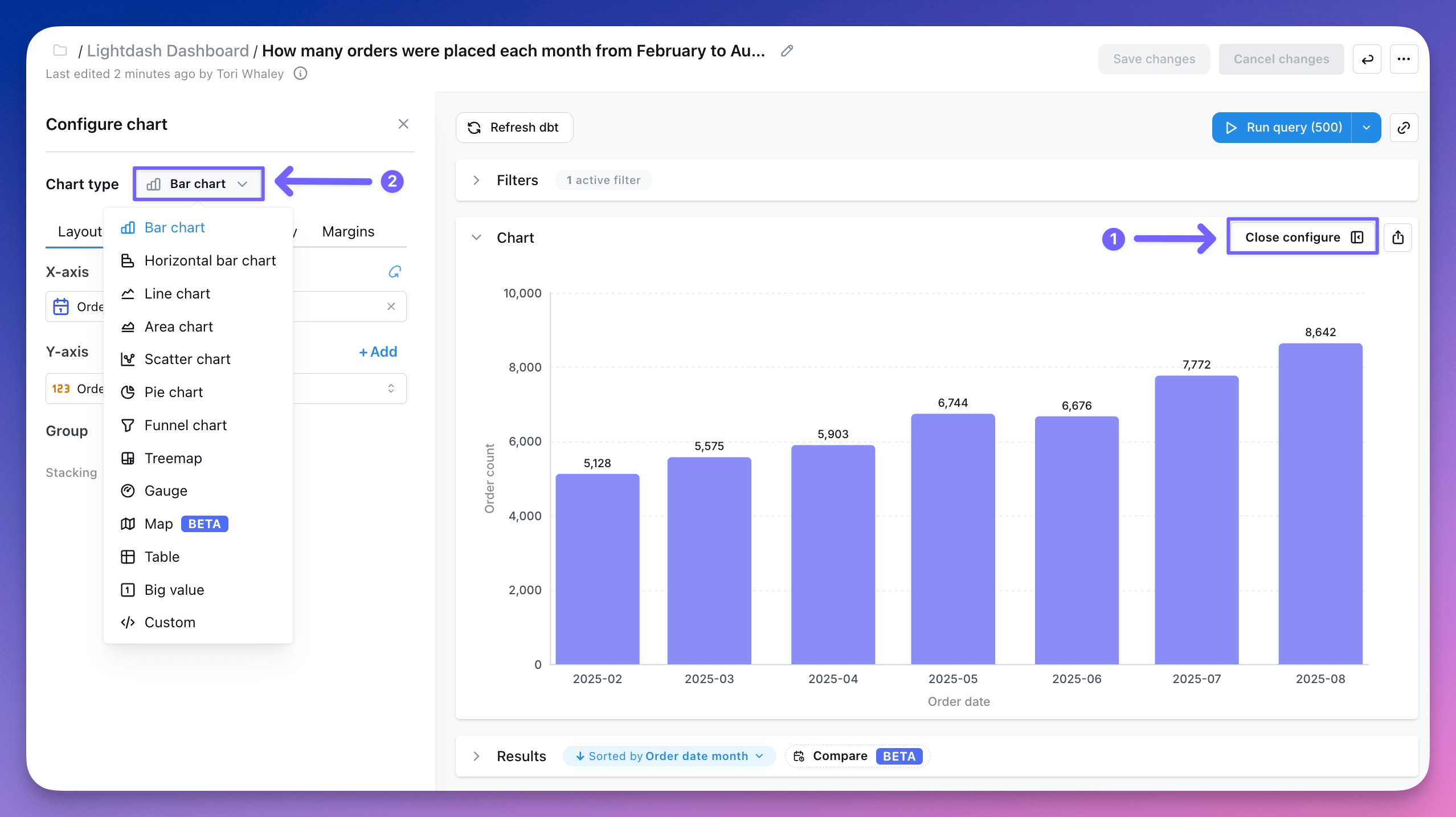
In Lightdash, the data in your results tables can be visualized in a bunch of different ways: Data app visualizations are AI-generated custom chart types built with data apps, and require data apps to be enabled on your instance. See the Data app visualizations guide for how to create and use them. The visualization type that you pick determines how Lightdash shows the data series in your chart. To change how your data is displayed, click Configure when you’re querying from a table. You have the option to change the chart type in the drop-down:

Bar chart

Use bar charts to compare things between different groups or track how a number changes over time.

Line chart

Use line charts to show changes in a number over a short or long period of time.

Area chart

Use area charts to show how values develop over time when the total is as important as its parts.

Mixed chart

Use mixed charts to combine bars, lines, and scatter charts on the same visualization.

Scatter chart

Use scatter charts to look at the relationship or correlation between two variables.

Pie chart

Use pie charts to visualize data that adds up to a meaningful whole.

Funnel chart

Use funnel charts to show pipeline performance, product conversion metrics, or any process with discrete stages.

Treemap chart

Use treemap charts to show parts of a whole using nested rectangles.

Sankey chart

Use Sankey charts to visualize flows between categories, showing how values move from sources to targets.

Table

Use tables for looking at tabular data or lists of things like user IDs or transactions.

Big value

Use big value charts to display a single value prominently.

Gauge

Use gauges to highlight a single value against a qualitative range, like performance against a target.

Map

Use maps to display geographic data on an interactive map.

Custom charts

Custom charts offer additional customization and an extended library of charts. The charts are powered by [vega-lite](https://vega.github.io/vega-lite/examples) - the link will take you to some example galleries of what you can build using this powerful charting library. This includes heat maps, bubble plots, box plots and more.